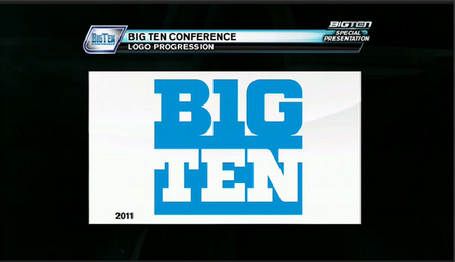
I loved the old Big Ten Conference logo. The hidden 11 is up there with the FedEx arrow in defining graphic design moments of my young life. Which is why it’s a little disappointing that the new Big Ten logo is… hideous . It looks like the Finnish flag for chrissakes!
Yeah: They went there, and yeah, it’s just l33tspeak. The B1G 73N, everybody! This means that in the future teams will be required to give press conferences in World of Warcraft, which should be a boon for especially combative reporters like Jay Mariotti, and also people who’ve always wanted to decapitate Jay Mariotti. Experience points will become much more important than experience.
The logo goes atop two divisions called the “Legends” and “Leaders”, which sound like World of Warcraft expansion packs. I have no idea what the “leaders” moniker is supposed to mean for all the teams that don’t end up leading the division or conference in a given year, but then, I’m not busy ruining a sports conference’s public image, so what do I know?


